Wednesday, 2 October 2013
Got a bit excited..
Got a bit excited and coloured my Eldarin in like a child with crayons. I am planning on completing a tutorial to colour from black and white so this is by no means finished. Just fancied sharing it as there are a couple differences in design since the last post.

Monday, 30 September 2013
Eldarin
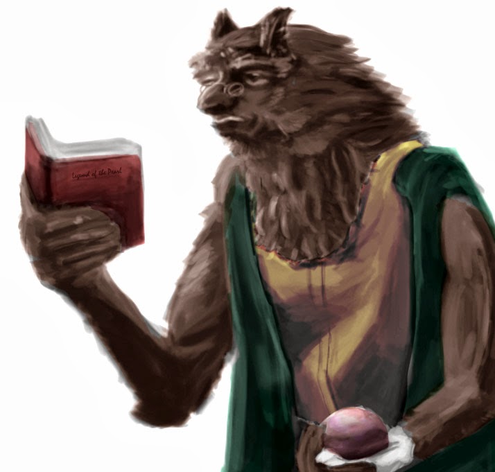
I've started my concept art project on David Gemmell's novel 'Dark Moon'. Here is one of the characters I've been illustrating the past couple hours after giving up after weeks on another!

This is an Eldarin; a race of intelligent pacifists. Its still in greyscale as I havent finished the values and details. I'll update as much as possible!
Monday, 16 September 2013
HRSS Logo
So I thought I'd update the HRSS clan logo. Good to do something ridiculous every now and then.


Let me know what you think.
Thursday, 29 August 2013
Painting again.
It's been a while since I have properly painted. My dissertation is my main priority, it still is, just thought I'd have a play with my tablet again. anyway here's an intense face..


Tuesday, 20 August 2013
Back from Corfu!
I'm back from Corfu after a great relaxing holiday, where I drew, slept, read and ate my way through the 9 days. Here are some of my drawings from that time, most of which inspirations and ideas for my up and coming University project "Dark Moon".


Tuesday, 23 July 2013
Muscles!
I'm looking at values again on muscles; these are quick paintings started by blocking out the negative shape of the limb. Then with a sketchy brush value is added by taking from the original reference. I have refrained from adding detail as I will do that in the future.


Monday, 22 July 2013
Sandstorm Cube Thing...

I'm some-what following Feng Zhu's video's and applying the perspective I've learnt to help me paint. This is a small break through for me and an important step for the paintings.
Saturday, 20 July 2013
Body Worlds - New Inspiration
Desperately needing to find anatomy reference I remembered this exhibition, not having been myself I'm having to work from scarce online images. I am looking to improve my value painting as well as bettering my anatomical visual library. Make of this as you will.


Wednesday, 17 July 2013
Floating Imaginary Heads

Using Andrew Loomis's books I am relearning to draw, currently I am working on Heads and Hands which has been fruitful. Above you will see a range of different heads from my imagination, there are successful and unsuccessful drawings, but am happy with the progression I am making.
Saturday, 6 July 2013
Textures and details

These helms are looking ok from a distance which is good as it means the Values, perspective and proportions are fine. However under closer inspection, they don't hold up to scrutiny; so the next step is details and textures. Hopefully in the next week or so I'll have another one posted up looking a bit better.
If you know of any good resources online or in books to help drop me a message.
*EDIT*
No use making another post, as I havent advanced any further with details or textures but here is a late night painting of one of my favorite book characters Dace from Dark Moon by David Gemmell.

*EDIT*
No use making another post, as I havent advanced any further with details or textures but here is a late night painting of one of my favorite book characters Dace from Dark Moon by David Gemmell.

Perspective is off on this piece but i think i can sort that with better lighting and body positioning.
Thursday, 4 July 2013
Another Post: Insects and Structures
I've come to realise Im becoming more and more nerdy as I get older; I have an increasing fascination with insects next I will be snorting and pushing up my glasses as I correct someone on the real latin name of an Ant or whatever...
Back on track I really enjoyed this exercise is mapping out the structure of the insects, the grub bug (center) was especially challenging because of the changing nature and contours of its body. Tell me what you think and if youre a concept artist get in touch and drop me some feedback!
Back on track I really enjoyed this exercise is mapping out the structure of the insects, the grub bug (center) was especially challenging because of the changing nature and contours of its body. Tell me what you think and if youre a concept artist get in touch and drop me some feedback!
 |
| Bugs Galore. |
Concept Work
 |
| This is a painting not based on reference. |
 |
| German Helm reference painting. |
I feel like I am improving, only time will tell though!
Wednesday, 26 June 2013
"Get the Fundamentals down or the fancy stuff won't work." -Randy Pausch
Fundamentals in draftsmanship.
http://www.youtube.com/watch?feature=endscreen&NR=1&v=vXoLPU9AklY
The title of this post has become a personal motto for this summer leading into my 3rd year of University. So far I don't feel as if I have bettered my illustration work in the first two years enough and for a long time I blamed my tutors/course for that. Surprisingly that whole 'pointing the finger' is counterproductive...
With this new philosophy sparked into life I am kindling the fire with Feng Zhu's school of design tutorials as well as fanning the flames with a new Youtube channel 'CGMWORKSHOPS'. If you haven't checked these guys out already and you have felt the same way I did, check them out; its a lot of hard work and swallowing of pride but I already see it paying off.
Value Armor

Tuesday, 25 June 2013
Practice Makes...
Thought a bit of an update was in order; I'm currently trying to better my basic technique through life drawing and perspective. Here a select few from the 60 or so I did yesterday, they are 1minute a piece.


I alternated between black and white canvas to try and make my eye see lights and shadows, however when trying to do this minute on minute I found it a bit tricky.
Thursday, 20 June 2013
Progression with Paint
Painting is starting to get addictive, but I don't want to just learn how to paint this summer its important that I reach my target of learning to utilise basics such as perspective, so I'm going to try and combine the two.


This Helmet perspective is based off of the original image (see previous post) but I've created my own angle: to do this you have to draw and understand the image in a 3D format.
Let me know what you think and keep updated with my work right here.
*EDIT*
Instead of making a new post Thought it would just be better to edit this one with an painting update.

I dont feel as if this painting was as successful as my others, however it was a more difficult angle. This will be last painting of this helmet but may continue with some perspective line drawings.
Wednesday, 19 June 2013
Learning how to paint...
I've wanted to learn how to digitally paint for a long time now and have finally put pen to tablet to have a go:
 This is my first ever painting and am satisfied in so far that it looks kinda like the helmet I was studying from! But I'm looking forward to getting better (hopefully) and trying it out some more.

Saturday, 15 June 2013
Book Jacket Design

This cover was for the Penguin Design Competition, unfortunately wasn't shortlisted but am looking forward to entering again next year. For me this was great fun to produce and design, I went through around 50-100 thumbnails to really eliminate and widdle down my ideas.
My mindset from the beginning was to not be generic, so I spent a lot of time looking at the other contestant's design to limit and stop myself from plagiarising. These limitations forced me to be as creative as possible with the text and lead me down a metaphorical and abstract approach.
Wednesday, 12 June 2013
Back to the Drawing Board.
Just to expand on my last article, I have created some more drawing. Here I am aiming to think 3 Dimensionally. Where as my usual drawing is in 2D, here I am thinking about the 3D shapes that make the object; in this case my dog Ben.
 Already I feel it is much easy and provides much more freedom to make bold marks. First I've drawn the shapes I see that make up the dog, I then work over the top of these shapes. I've found that listening to epic music speed up my hand and stops my brain from over analysing, which can make the drawing suffer. For the mix I listen to you can go here: https://www.youtube.com/watch?v=2hJ0l64sRJc

Learning to draw again.
I've never been taught to draw so the technique that I have is just things I have picked up from drawing a lot. So I'm going back to basics to be able to 'technically' draw; this means re-learning the proper techniques to draw proportions, negative space etc. In addition to this I have been learning to do this in photoshop. I had a muck about with some shapes a couple minutes ago and made this:
 The lines are in blue as to differentiate in the later stage of painting between the linework and the painting at hand. Its a bit of fun and am looking forward to doing more.

Thursday, 6 June 2013
Busy day..
I'm almost there with the logo design. Here is the latest iteration of it. It could be lacking colour but it looks as if I have solved the recognisability of the pencil by adding a slant to it. This is the most appropriate association for this logo, otherwise it would have been school pencil yellow, which D&AD sport on their logo. Although a splash of some colour would be nice, tone down the corperate feel to the design.
Final thoughts: The typography has a more intimate relationship with the image which I think brings the idea of Howdon and illustration being closely linked. I wonder if I should pop in some 'go faster' lines to give the viewer the sense of a speedy business, such is the illustration and graphic design world.

Final thoughts: The typography has a more intimate relationship with the image which I think brings the idea of Howdon and illustration being closely linked. I wonder if I should pop in some 'go faster' lines to give the viewer the sense of a speedy business, such is the illustration and graphic design world.

After Review...
Thought I'd get back to this now rather than later. Changes: Larger lead - making the 'H' the body of the pencil instead of the negative space in it, the 'i' is still less obvious but am happy. Use of squiggly line (A) and perspective pencil mark (B) help guide the viewers eye.
If you've seen this already try and image you haven't and that you don't know its a pencil...
 |
| (A) |
 |
| (B) |
A day of Graphics and forgetfulness...
Today's been interesting, after collating holiday 'things to do in Corfu' information together into postcards I realised I've hand a bit of graphics withdrawal which led me to making an illustration website layout and trading logo's.


 |
| Website Layout. |
 |
| White? |
 |
| Or Black? |
I'm happy with the logo itself as it included everything I set out to do; combine an 'H' with the negative space of the pencil leaving an 'i' to be visible. An the other hand, I feel I need to change the typography; not by much, just is lacking in something...
Just also thought of adding a graphite streak leading the eye to the pencil, the roughness of the graphic texture might balance out the image a bit.
Suppose it's time to eat lunch..
Thursday, 30 May 2013
Houdini Poster

Having a background in magic, making posters was inevitable. I've wanted to make some for a long time, although this is just a rough, its a good starting point. I want to portray the magician, their style of performing and the time they lived in each poster. I chose a graphic novel style approach to the illustration in this poster because a) its a callback to my roots and b) I think of Houdini as super hero of his time.
Friday, 5 April 2013
Meet Tony Gregson.
This Easter Break I am finally able to hit my project on Gold hard. To that effect here is the style and a sneak peak at how Tony will feature in the publication.


Monday, 18 March 2013
Swimming up stream to get the Gold.
 |
| Mauretania - The ship Gregson stowed away on. |
"Choose one contemporary or historical artist (e.g. James Turrell, Liliane Lijn) whose work relates in some way to both art and science. What themes does their work cover (discuss with examples)?"
And that was the best of a bad a bunch.
What I really want to be doing right now is my Gold project, not to mention the exhibition needs sorting out. Ahh well this graphic will have to do for now while I trudge through the knee high waste of my essay. Too dramatic?
Monday, 4 March 2013
Wes Studi
 |
| A GIF from the website. |
Saturday, 2 March 2013
Website Update
 |
| This is my updated website Index page. |
This is my work from this morning: added more content, formatted the text, rounded off the content box and dropped a shadow behind it too. Found a great tutor on Youtube, his videos are descriptive and refresh you on basics making it a great way to learn how to code in CSS.
http://www.youtube.com/user/DreamWeaverTutorial?feature=watch
Wednesday, 27 February 2013
Web Design Project 2: Index
This is how far I've got in the past 2 days from knowing nothing about CSS/HMTL coding or Dreamweaver. Its still a bit rough around the edges, for instance the text still needs formatting and the blue box to be re-sized. However my breakthrough moments were when I got everything to remain centered and having a double roll over image onto one image.
 |
| Index Page. |
 |
| Cowboys 'Rollover'. |
 |
| Indians 'Rollover'. |
Wednesday, 20 February 2013
The Question is...
....do you feel lucky, punk?

This is for my website project on Cowboys in film. Enjoy!
Monday, 18 February 2013
I Love Gold!

As a race we have a global obsession with gold; genocide, theft, murder all follow in gold's wake throughout history. The aim of my project it to understand and highlight why it is that we obsess over a shiny metal.
Monday, 11 February 2013
'Wing a tit in there...'

Gavin Free
This idea came from the Roosterteeth podcast no.203. Really funny back and forth with Babara.
A bit of 'Life Drawing'
 |
| 2 minute heads. |
If you'd like to see Nick's work..
thisisnickwhite.com/portfolio
 |
| Quick 'thrashy' sketchs each 30 sec. |
Wednesday, 23 January 2013
Zina Saunders!
Just relistening to the final installment of the illustration island podcast with Zina Saunders and Thomas James. Her politcal caricature's are fantastic, favourite of which is Romney on Reagans knee. Bloody hilarious!
Check her out my 5 pencil pushers!! hah
http://www.zinasaunders.com/
Check her out my 5 pencil pushers!! hah
http://www.zinasaunders.com/
Monday, 21 January 2013
Web Design's a Bitch.

Ok so I've done 'Comic Page'.... thats only, 1,2,3,4...oh dear...
Colours are a bit batty but its a CMYK so whats a guy to do? Finals will be in print anyways :)
If you are also suffering under a pile of work feel free to comment below.
Friday, 18 January 2013
Magic Logo from ages ago!

This is the base illustration for my business card logo that I forgot to publish.
The Roll of the a Dice.

Subscribe to:
Posts (Atom)